Normally I make my cover art while a book is out for editing, but since my next book is the sequel to The Gray Shift and I already made a cover for that one that I could use as a template, I decided to jump ahead and make a cover for The Unsettled Compromise first before I finish the outline.
As before, all of these images were created using Inkscape 1.2.2, a free open source vector art program that’s roughly equivalent to Adobe Illustrator.
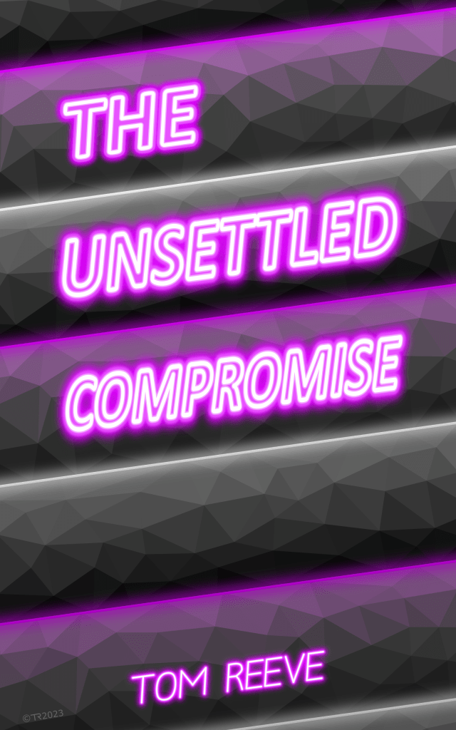
For The Unsettled Compromise I wanted a cover similar to what I did for The Gray Shift, but with a different color scheme. Instead of a red, white and black color scheme like The Gray Shift and Full Coverage covers use, I originally wanted to use amber and purple to match the colors I’m using for the two fictional political parties in the book. Specifically, I wanted to use Amber and Electric Purple as inspired by the Triadic Color palette shown here.
The first thing I did was try a few color scheme with amber stripes replacing the white ones and purple replacing the red ones. I also tried out using both purple and amber for the neon outline on the text.
One issue that came up was that UNSETTLED and COMPROMISE are much longer words than GRAY and SHIFT so I had to condense the text on the two words to get them to fit. For the first three I left the THE from THE GRAY SHIFT as it was. On #’s 4 and 5 I condensed it a bit to match the text in UNSETTLED.
The amber color doesn’t have as good contrast or readability in either the text or the background bars so I dropped that and went with just the purple and white color scheme going forward. I could change the amber party to white in the book to match, but that would be a bit too obvious considering their role in the book.
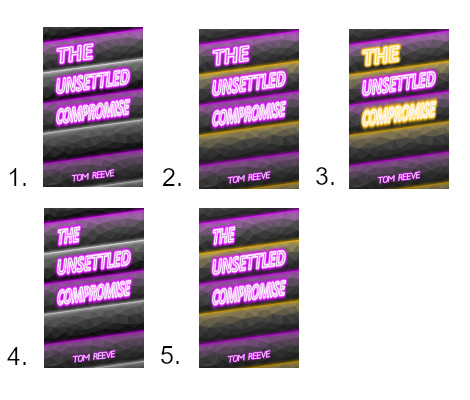
The next few variations were just adjustments to the font scaling to make it more readable. I finally settled on # 9, which is condensed both horizontally and vertically. This makes the overall size of the letters smaller, but maintains their proportions better so it’s actually easier to read than the tall but squashed letters in the earlier versions.
I also tried fraying the edges of the bars a bit to make the background seem more distressed/fracturing in # 10, but that didn’t add anything and just made it look messy in those areas.
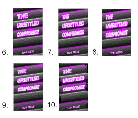
That leaves us with our winning cover, # 9! Now on to finishing the outline for this book!