

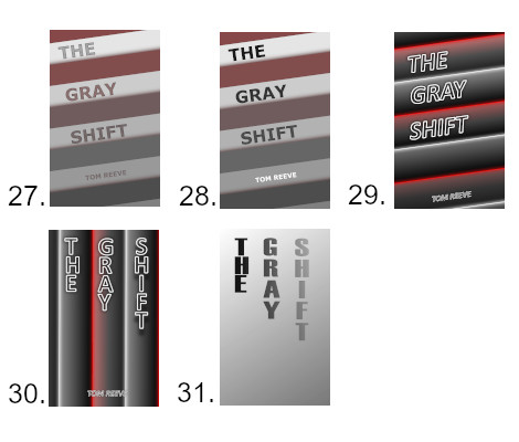
This past weekend the SF Bay Area got slammed with a ton of storms, so what better way to spend a rainy weekend inside than making the cover for my next book? Here are all 44 of the variants I went through before arriving at the (hopefully) final design.
All of these images were created using Inkscape 1.2.2, a free open source vector art program that’s roughly equivalent to Adobe Illustrator.
The only font I used is actually Calibri. Yes, the one that’s been the Office default since 2007 and was supposedly retired in 2021, but still shows up as the default in my Office 365 version of Word. Maybe they never retired it? Or maybe that’s a thing you only get in Windows 11? Who knows. I did use the Bold/Italic version of Calibri though (so exotic!) and as we’ll see I made some other changes to the font to make it look much cooler than a default Word document.
First off I started by doodling a few concept ideas by hand. The concept I was going for was the wavy red and white stripes of the American flag gradually being desaturated to gray as you went down the image. The title text would then go on top of that with a different word for each row.
Next up I started using Inkscape to try create the cover art that I had doodled in vector form. First up I tried a few variations using wavy curved flag lines in a few different sizes. Some had red and gray stripes, some had red to gray gradients, some were completely grayscale. I also tried having the title font fade to gray as well, but that made it hard to read so I also tried solid white font with a black blur around it. That made it easier to read but kinda dull looking. The curved flag lines also cut down on how big I could make the title letters without them crossing each other and bending the title to follow the curved stripes made them even harder to read.
The images to the right are all sized to the Amazon thumbnail height of 160 pixels as they would appear in the related items view on the store. The full image size is 2560×1600 so this is only ~6% of the full height and I want my cover to be legible at both sizes.
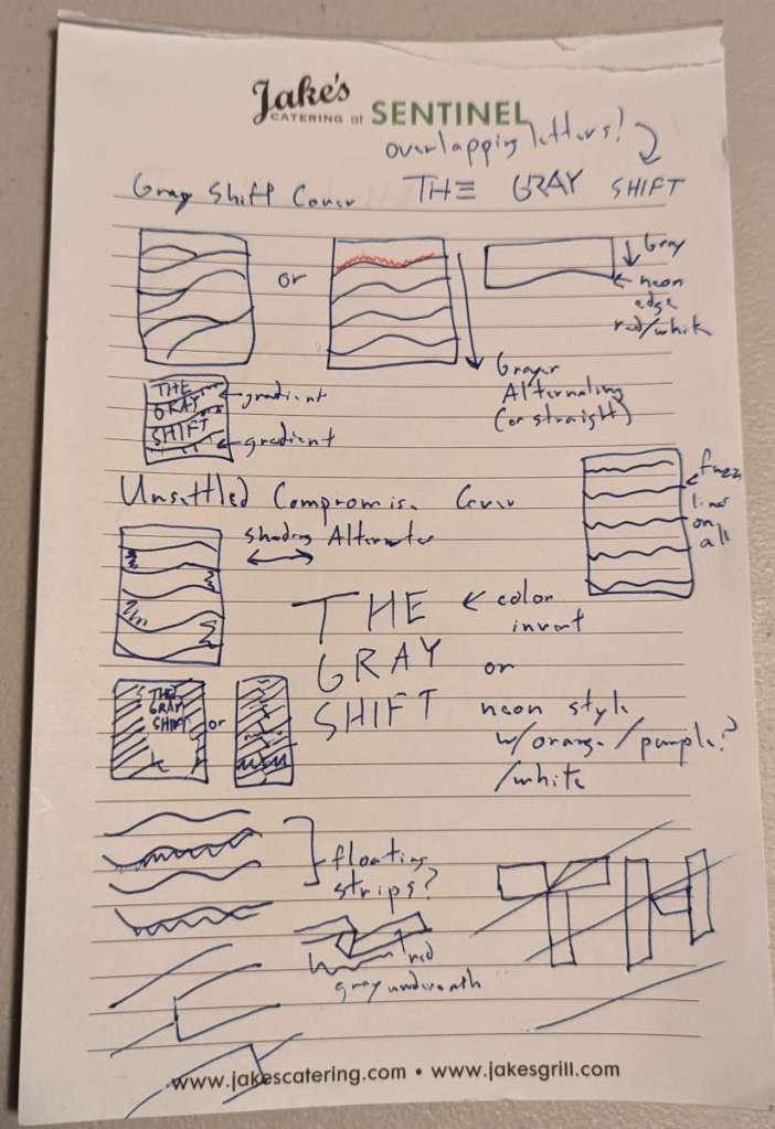
Since the curved stripes were taking up a lot of space, I then tried going for straight angled stripes instead. This let me make the title text bigger relative to the stripes and also gives the cover a cool action movie feel, which fits well with a satirical thriller book. At this point I skewed the font to follow the path of the stripes, so it stops being standard Calibri at this point. Next I tried out going full grayscale to fit The Gray Shift book title theme more, but the text gets lots in the stripes when everything is a shade of gray. I also tried out solid white, outlined white and gradient white to transparent text. The outlined white and the solid white text worked the best, but more iteration was needed and not just because Inkscape made all of these versions 30% transparent for some reason.
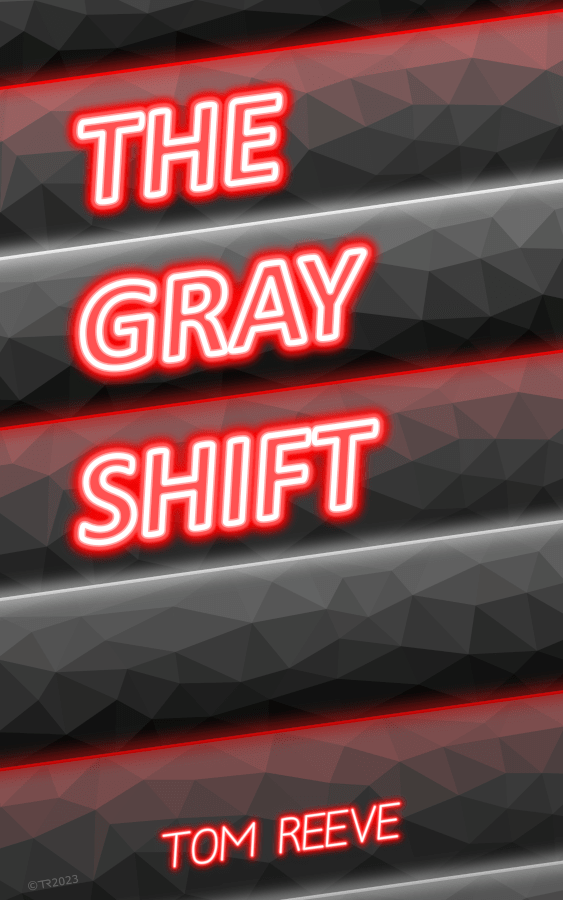
Next, I fixed the transparency issue and then tried playing with the text to make it stand out more. The solid text was very easy to read, being white text with a black outline, but it still looked very Powerpoint slide like. The white outline text on the other hand looked promising, especially when I increased the thickness of the outline to make it seem brighter. I also adjusted the red stripes so that they went red to black instead of red to gray, this increased the contrast on the title text and added a bit of a glow effect to the bars, which I further enhanced with a thin neon light style line across the top of each stripe.
At this point, my top cover was # 24. This had white outlined text that was thicker, but not too thick and red to black and gray to black alternating gradients down the page.

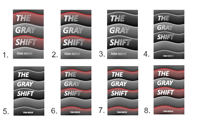
Before proceeding further down this path. I tried a few alternate ideas just to see how they would look. Using just flat red and white stripes that desaturated to gray down the page fit my original concept, but in practice it looked very dull.
I also tried some vertical text ideas but they just made the title harder to read and didn’t really make anything better.
I did also try darkening each row a little bit on the previous best image with # 29. This was subtle but did enhance things a bit.
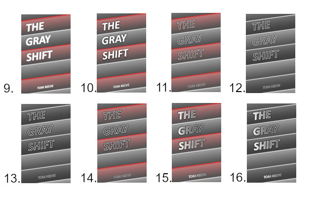
Next, I tried adding some texture to the image using this Vector Abstract Background Tutorial from Nick Saporito, with the existing red to black and gray to black stripe gradients as the base images. This extra detail isn’t really visible at the thumbnail level, but it adds a good amount of detail when you see the full size image and makes it seem more professional looking.
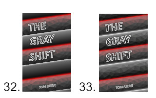
At this point, the cover looked like # 33. Texture applied and white outlined Calibri font on both the title and author name. But the outlined text on the smaller author name was a bit hard to read so changing that would be the next step.
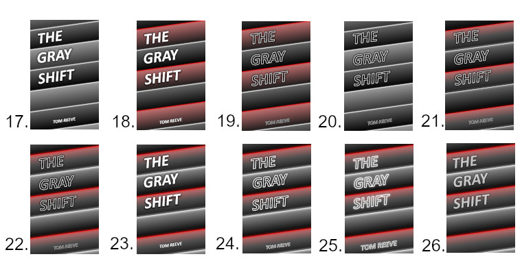
The following day I took some time to try tweaking my name at the bottom of the cover. Since the text for my name was smaller it was harder to read in outline form. Filling it in with white made it easier read, but it also made it stand out more than the title itself.
I tried some red lined and red filled text at this point also, but it blended in with the background and was illegible at thumbnail size.

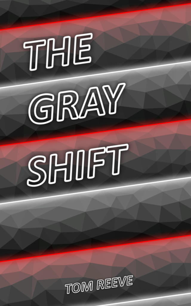
I wound up just drawing my name by drawing lines halfway inside the outlined version of the text. My name is now just a bunch of solid white lines with a thin blurred black copy behind it to give it a subtle outline. This is cover # 35.
Now we were getting close to a final design. I probably could have stopped here but instead I continued on soliciting feedback from friends and got some very good suggestions.
The first suggestion was to add an low opacity black layer in between the title text and the background to enhance the contrast. I did this and had it increase by 5% for every bar as it went down the page to get a subtle “fading to darkness” effect on the background. I also fixed the title text so that it was aligned and centered my name.
The second suggestion was to try out adding red to the title text to make it stand out more against the gray background. Since I knew from #’s 37-39 that just filling it in with red would be hard to read. I instead used Nick Saporito’s Neon Text Effect tutorial, but I skipped the background gradient part since I already had a background. After playing with it a bit, I found that having red outer “glow” layers with a white “hot” layer in the center contrasted well with the background but was still very easy to read. I applied this effect to both the outlined title text and the single line author name and it came out very well!
I also played around with making the background darker to see how that would look.
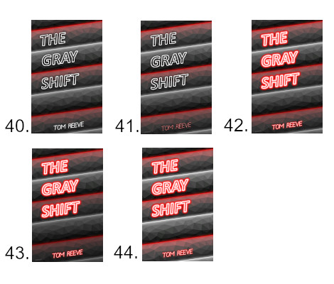
I liked the slightly dark opacity layer version in # 42 (apparently the real question was how many iterations does it take to make a good book cover!) so I’m sticking with this one for my final ebook cover for The Gray Shift!
Next up, I still need to create the paperback version of the cover. That shouldn’t take too long now that I have the ebook cover done but it will take some adjustment since the paperback is 9×6″ (aspect ratio of 1.5) and includes a spine and backside, while the ebook cover is 2560×1600 (aspect ratio of 1.6) so I can’t just scale it up directly. I’ll probably do that while the book is out for editing.
After that, assuming the beta test and editing go well I’ll also create the cover for the sequel, The Unsettled Compromise. Unlike this cover and my Full Coverage cover, that one won’t be red/white/black, I promise! It will be Amber and Electric Purple instead!

Pingback: Making The Unsettled Compromise Cover in 10 Steps! | Books by Tom Reeve